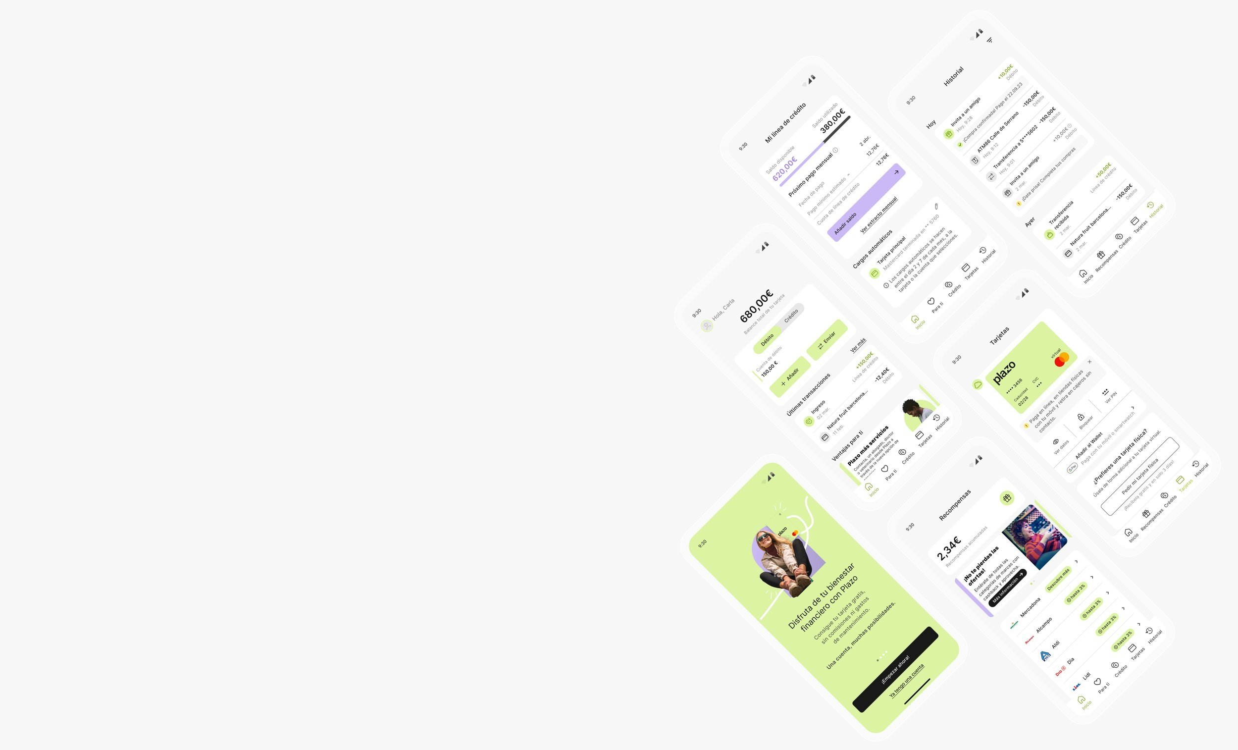
Let me tell you a little about this era of my life…
I got into an interesting challenge, where I needed to improve the conversion rate and utilization of a brand-new financial app. I got in as a UX researcher only by name because the challenge was more than that. We were 2 designers and a product manager with this challenge to make sure the app was having over 4k new users per month. This was a good opportunity to understand the real deal of what a financial app would need.
Micro loan app redesign.
Micro loan app redesign.
The Challenge
The challenge was to improve the bugged MVP into an interesting and functional app (or at least leave it without bugs). The product was Plazo, this is a financial app where the main product is a card 2 in one (credit and debit). Their main focus is to have micro-loans for those who need a little push for the end of the month.
My way of working is by having initiative wherever is needed and proactivity, I don’t need anyone to tell me what to do (besides the business interest). I have always been proactive but the lack of leadership in this project made me switch from a UX researcher to a PM UX manager. As I showed results, the company started trusting me and my instincts. This is how I managed to have more freedom in my role and how I managed my tasks.
Role: UX designer
Time: 1 year.
Design Team: UI Camila Yamada, Product Manager Irina Sedova.
Tools: Figma, Miro, Google Slides, Microsoft Teams, and Jira.

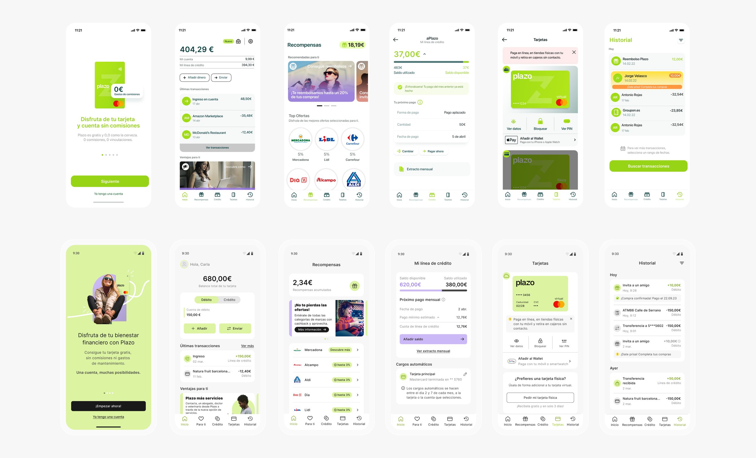
My proactivity road started with the implementation of the new branding approved. When we were trying to implement some fixes we figured that the app didn’t have any design system. We figured that the implementation of any change or the simplest fix was taking really long for developers to deliver. Also, throughout the complete app, there were a lot of inconsistencies in the components which made the usability challenging for the user. The first impact was on the main screen as the components were difficult for the user to follow a simple difference between debit and credit balance or even for doing a top-up. So we needed to increase the repayment of the user and the usability of the app. In some user testing, we had a big insight into users repaying their credit by doing top-ups and this makes us understand the importance of redesigning the Home Screen.
We had so many usability misleading flows, that we decided to implement a complete redesign with the rebranding and also to make sure we could have proper consistency through flows or components. We prioritized the backlog based on the amount of mistakes and urgency for the business. To be able to implement this priority we used data to make sure the urgency of the business was supported by data of misleading.
For the Home Screen, we entered into an ideation process because we were trying to figure out how to differentiate the balance of the physical card by dividing it into the 2 amounts, by credit limit available vs the amount available by debit. I did as a product designer the changes of the main screens without any design system created yet.
In the tests, we started understanding a lot of use cases from the home screen that we could start experimenting with. For example, we wanted to make sure there was a place for debit users to apply for credit if they wanted to. Also, we understood there was a possibility to explore a little more the interaction of the home screen by showing more information about discounts or cash back. For these scenarios, we did user tests, proof of concepts with some surveys, and focus groups.
Hierarchy of elements
We divided the usability test into the main tasks that would prove the job for each component of the screen based on the main priority. Every round of tests we present to the board for ideation and iteration based on the business priorities. The main jobs for the users to achieve are to recognize their balances and be able to pay their credits on time. We stopped doing iterations until we got at least 90% of the tasks achieved in fewer seconds by the users.
Based on all of the findings, the proposal started with the hierarchy of the elements and the main interactions. The priority of the findings based on the weight of the patterns where the following:
The user wanted to know their money available
The user wanted to know where the money was going
If the user has credit, when and how much they will need to pay.
Following the findings we created the hierarchy of the elements:
My card balance
What is the balance including
Details from the balance I can interact with.
Main interactions
The user needed to be able to switch between credit and debit whenever they wanted.
2. The user needed to know where the money was going.
3. The user needed to see what was new and how they can interact.
Final Deliverables:
We showcased the proposal to the board to get some feedback and we polished all iterations but the main proposal was accepted. After we iterated the main changes we created the presentation for the investors and the tasks for Business analysts and developers.
Mainly we needed to divide the implementation into 3 parts:
the switcher
the components of the transaction
the carrousel.
The main differentiator was the designation of a color to a product, green for debit and purple for credit. This was a simple improvement for communication and recognition per product. To implement the redesign in all screens with this main improvement was difficult to keep on track. But also it gave me a really good organization and understanding of the process. We divided the ones that needed to go through Business analysts and the ones that were only front-end development so we could implement all changes at the same time but without being stuck with the waterfall. Obviously, there were times when the app was a hybrid but always functional, this was the only way to implement with the team, time, and objectives.
Learnings
I believe the best learning curve I got here is that I am now seeing in every app a place for improvement as an excitement rather than a complaint. I believe this opened my eyes in the market to believe that every experience has a place for improvement if it works. The redesign made me understand better the stabilization of the app and the data recollected for every bug was used in the redesign prioritization.
Thanks for reading and hope you enjoy your life!


